MatthewLiegghio
Art Director/Brand Designer/Creative Strategist
I have been the client as well as the designer. Two brands of my own, eight issues of a magazine nobody commissioned, and nine years of other people's problems. It taught me the difference between a brand that presents well and one that still works on a Tuesday.
Symbio
Hospitality · Identity / Brand identity, art direction, image direction
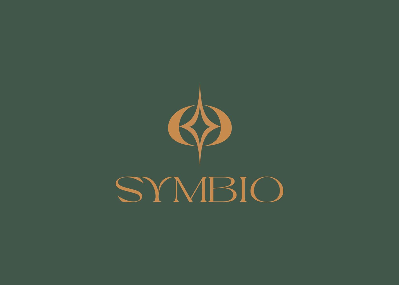
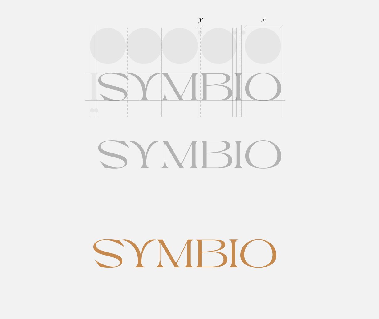
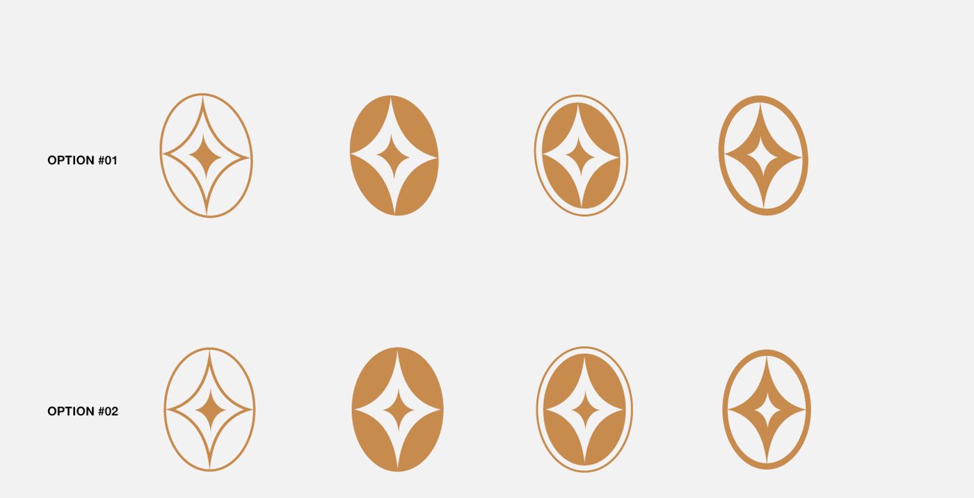
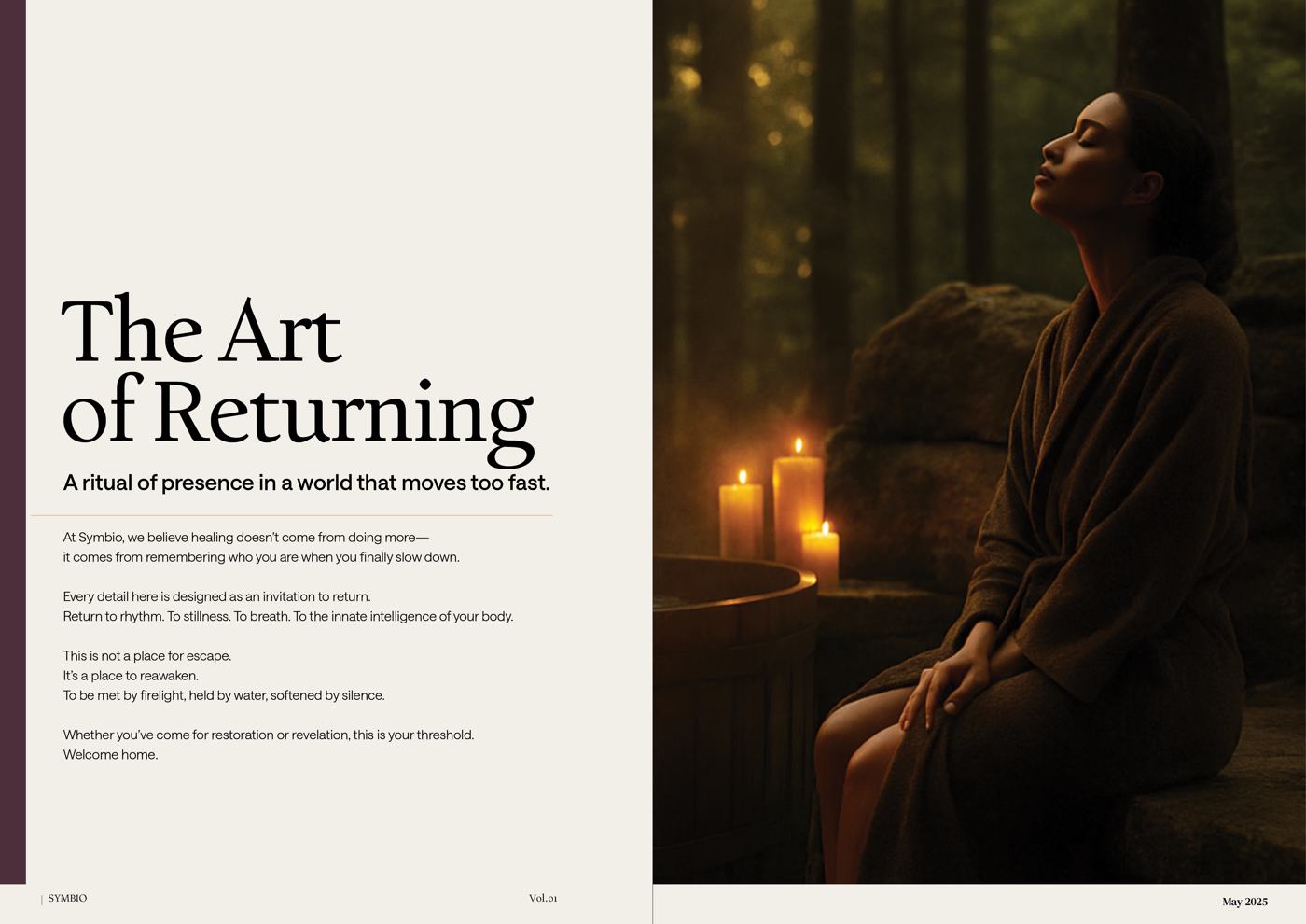
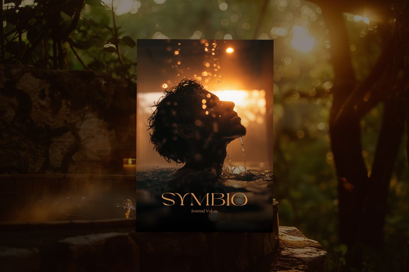
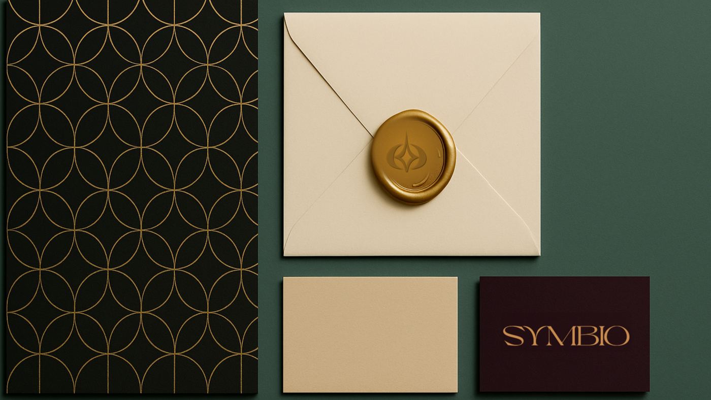
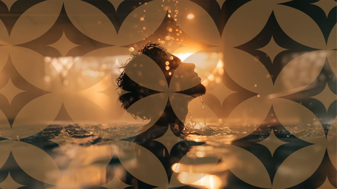
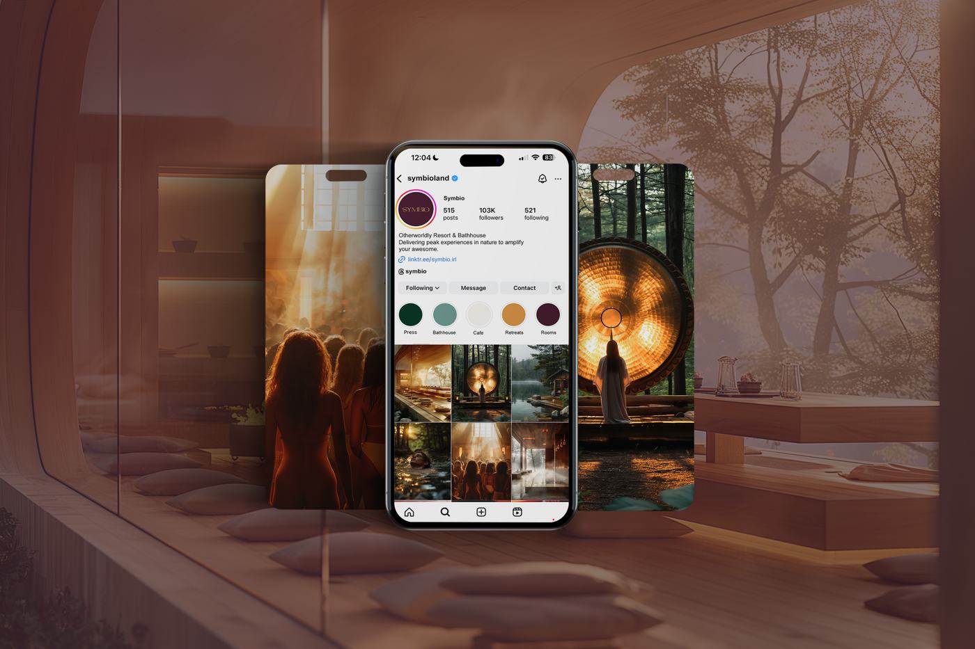
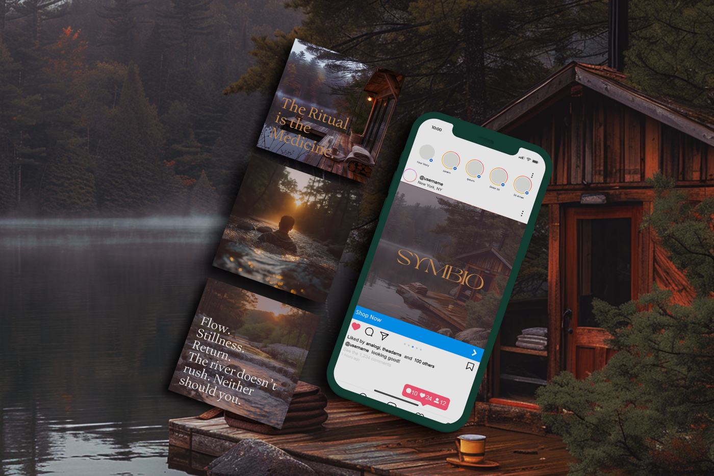
Construction is under way on a former lodge site in the Almaguin Highlands. Doors open in 2027, which meant branding a place nobody can walk into yet. The mark is a four point star inside an ellipse. People read it as a portal or as light sitting on water, and both readings are fine by me. Rotate it, repeat it, and it becomes the pattern that runs the walls, the wax seal, the journal and the feed.
- Year
- 2025
- Scope
- Mark, wordmark, pattern system, colour, journal, social, image direction
- Wordmark
- Final direction selected by the client from options presented
- Imagery
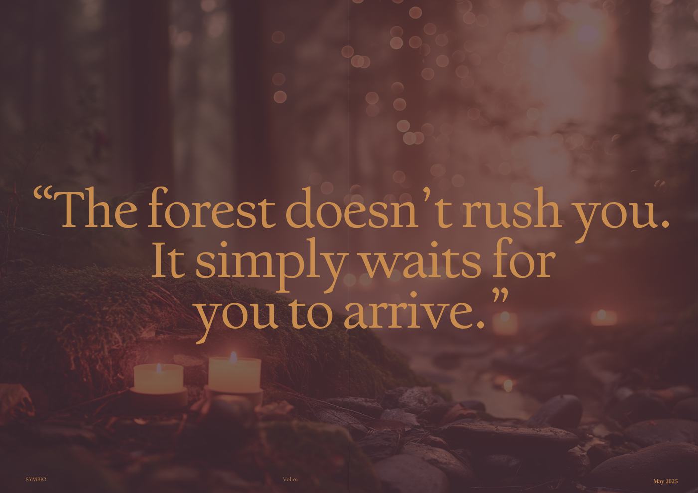
- Generated, since the property is still under construction
- Status
- Client work, in use ahead of a 2027 opening
Spirit Soul
Book design / Design and art direction at Charrette Studio, under ECD Dave Barnes
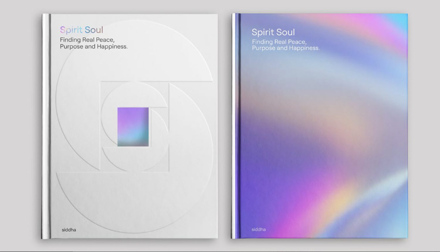
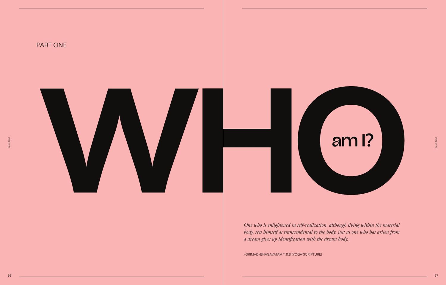
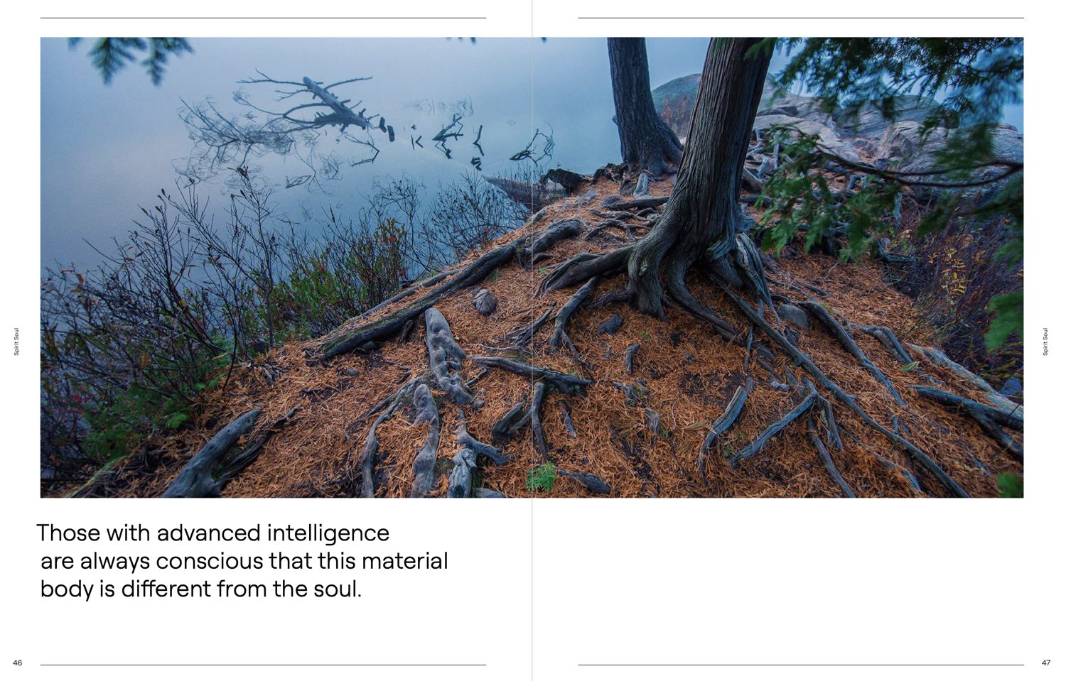
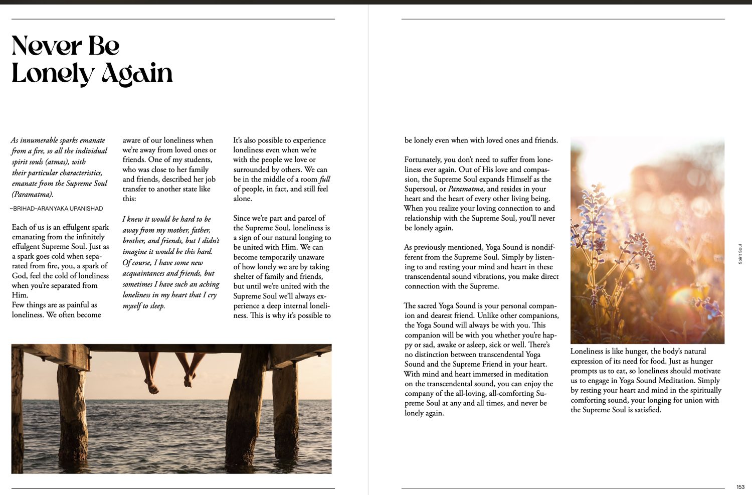
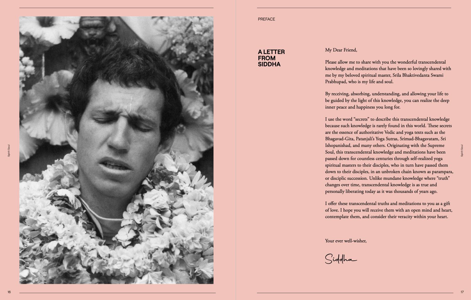
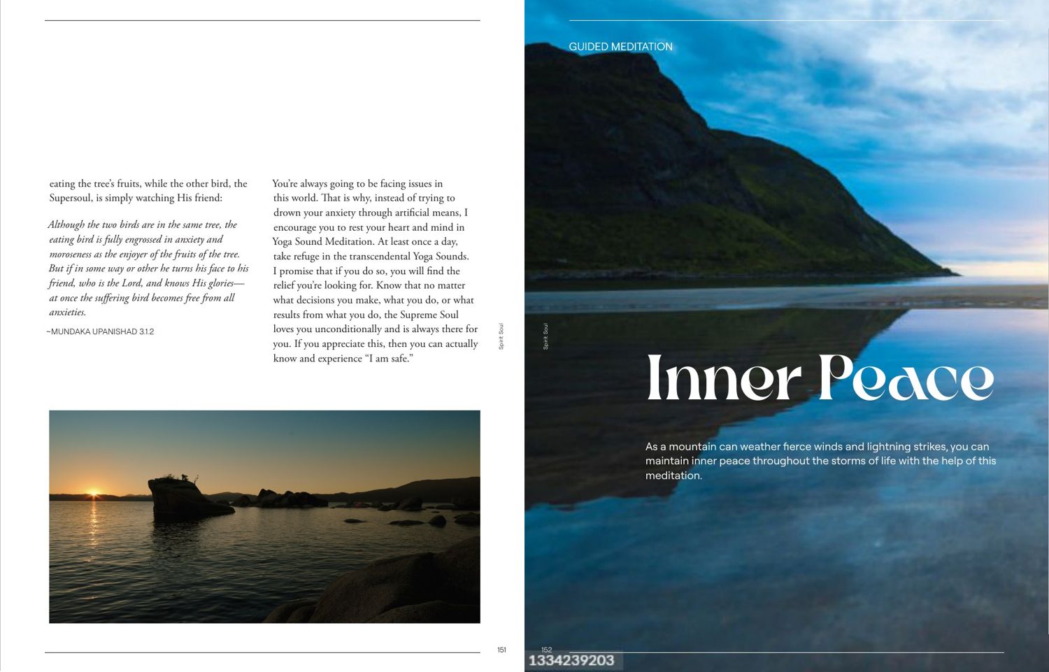
A 270 page book on peace, purpose and happiness, aimed at readers who would never pick up a religious text. The job was to make ancient philosophy feel contemporary without stripping the weight out of it. Three parts, each opening on a single word set at the full width of the spread, and a run of guided meditations sitting inside the book on photography and colour. Body text keeps a quiet serif and a narrow measure so a long argument stays readable.
- Year
- 2023
- Scope
- Grid, type system, section openers, image direction, layout
- Extent
- 270 pages, hardcover
- Status
- Client work, published
Carnivore Aurelius
Merch · Apparel / Art direction, illustration commissioning, typography
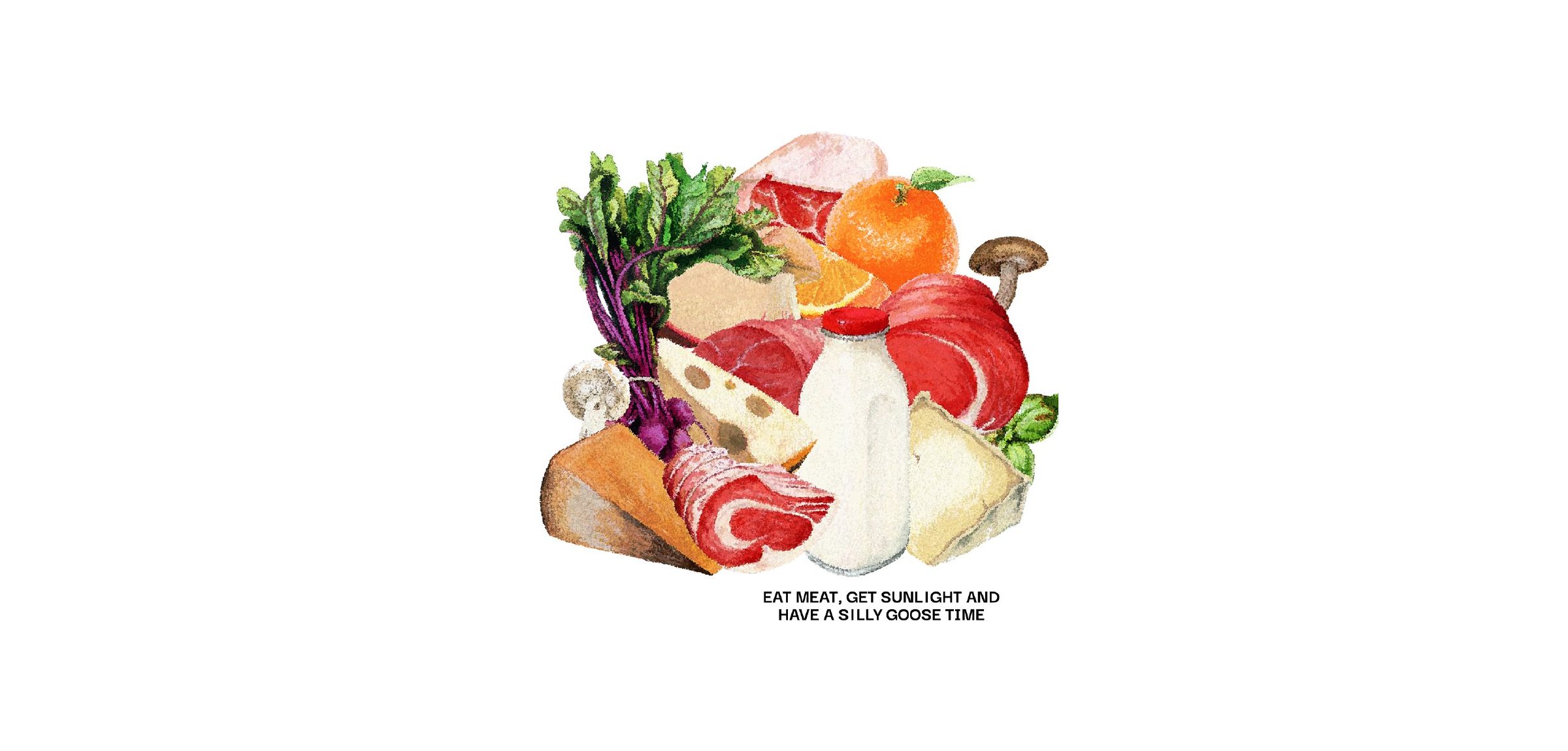
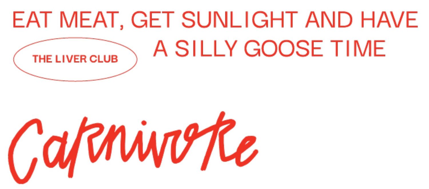
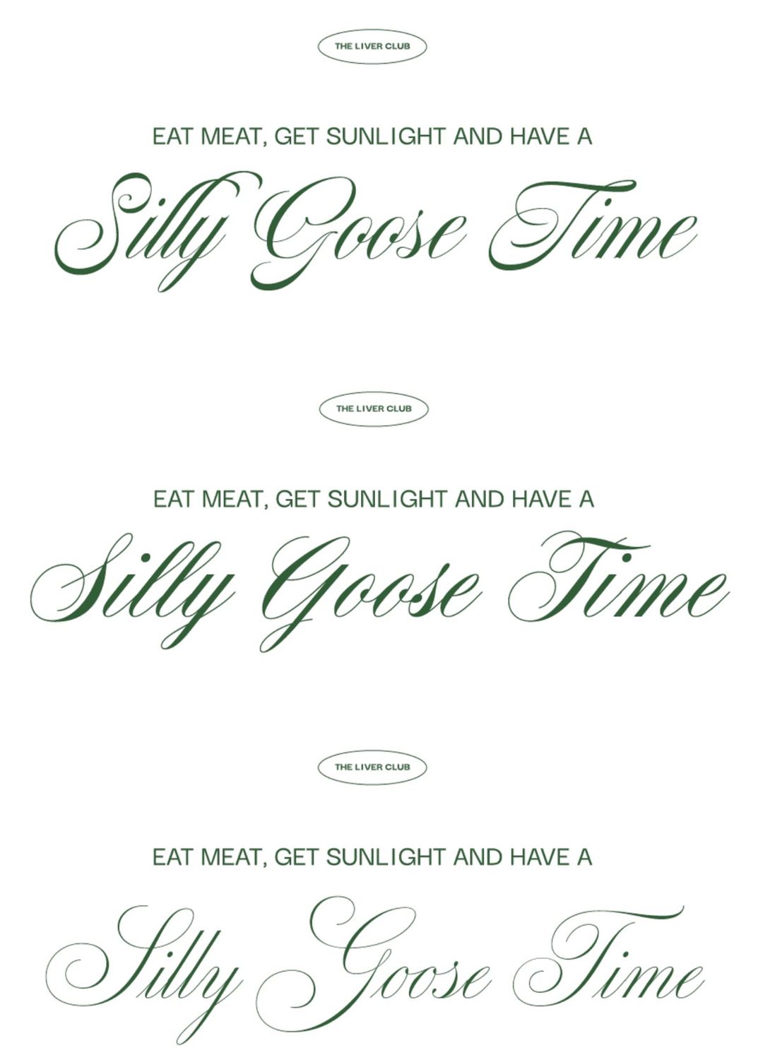
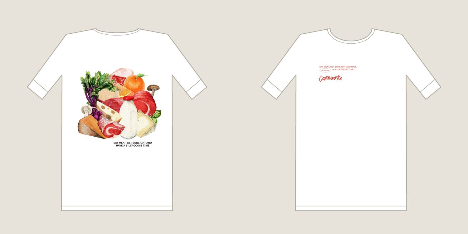
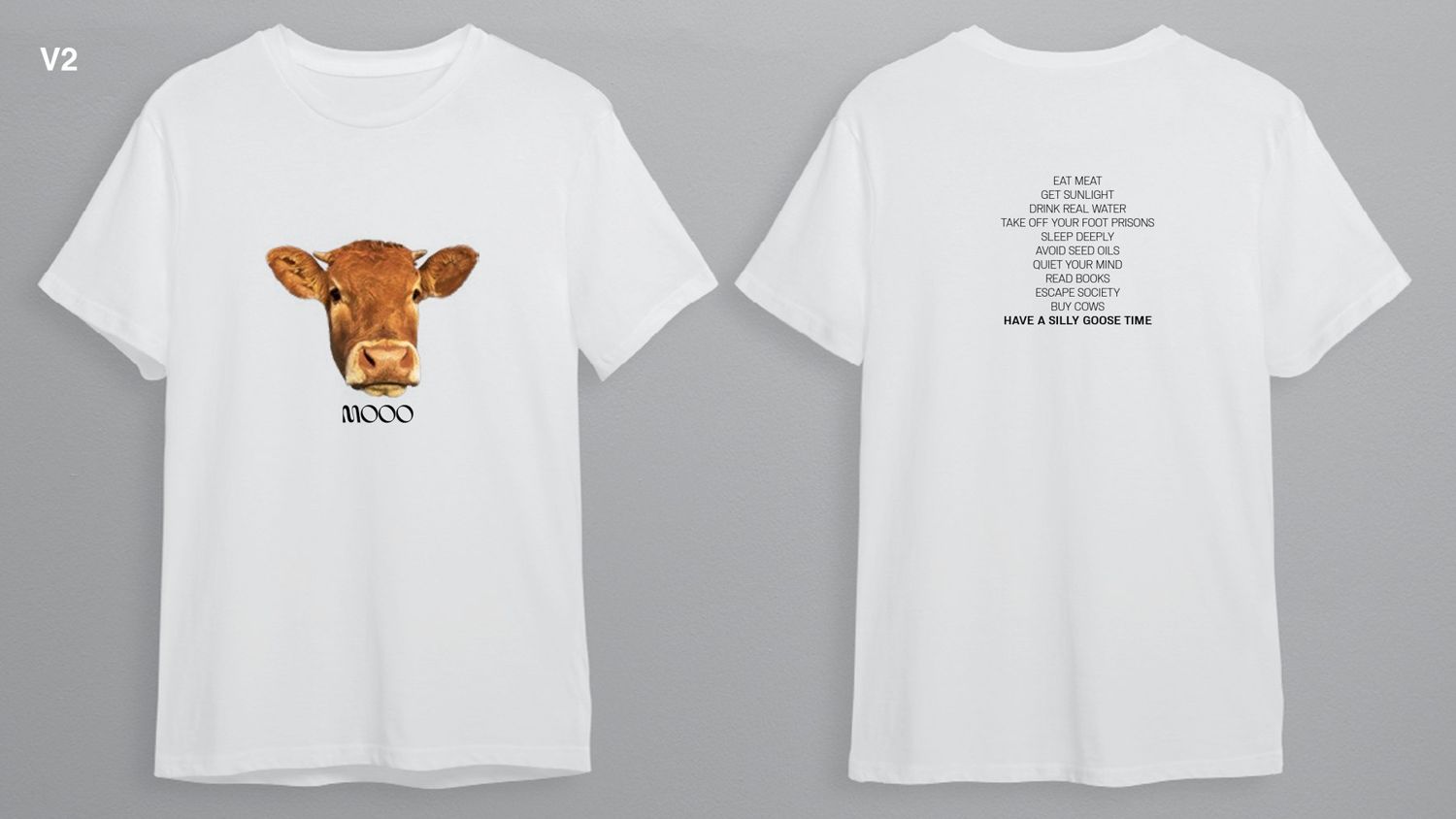
A collab tee for Carnivore Aurelius and Broya. The brand runs on a half serious creed, eat meat, get sunlight, have a silly goose time, and the merch had to be funny without being a joke shirt. I wanted it to feel like a grocery rather than a gym, so instead of icons or a 3D render I commissioned a painted still life, briefed the palette and the food list, and worked an illustrator through composition rounds until the pile read as one shape at shirt scale. The type plays it straight against the humour. Clean red caps, a hand lettered Carnivore, and a small badge reading The Liver Club, like a membership card for people in on it. A second direction set the same line in formal copperplate script, where the elegance is the joke.
- Scope
- Art direction, illustrator commissioning, type, garment layout
- Directions
- Two, front and back planned as a pair
- Status
- Launched
20 Seconds
Independent print · Berlin / Co-founder, art director, designer
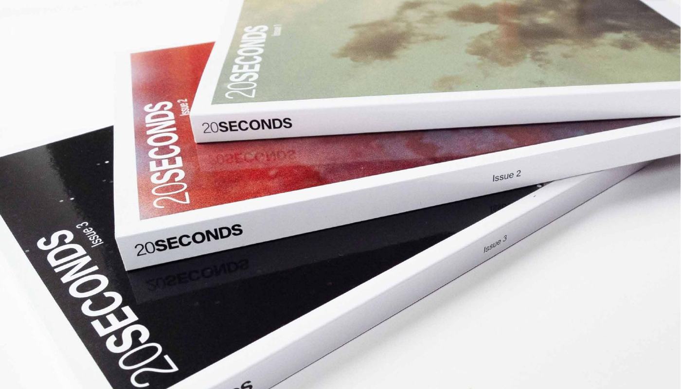
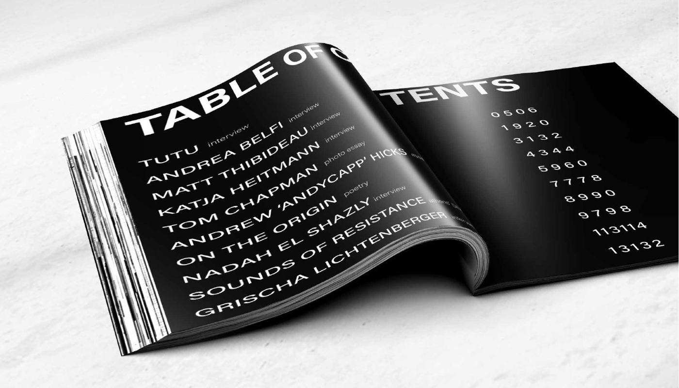
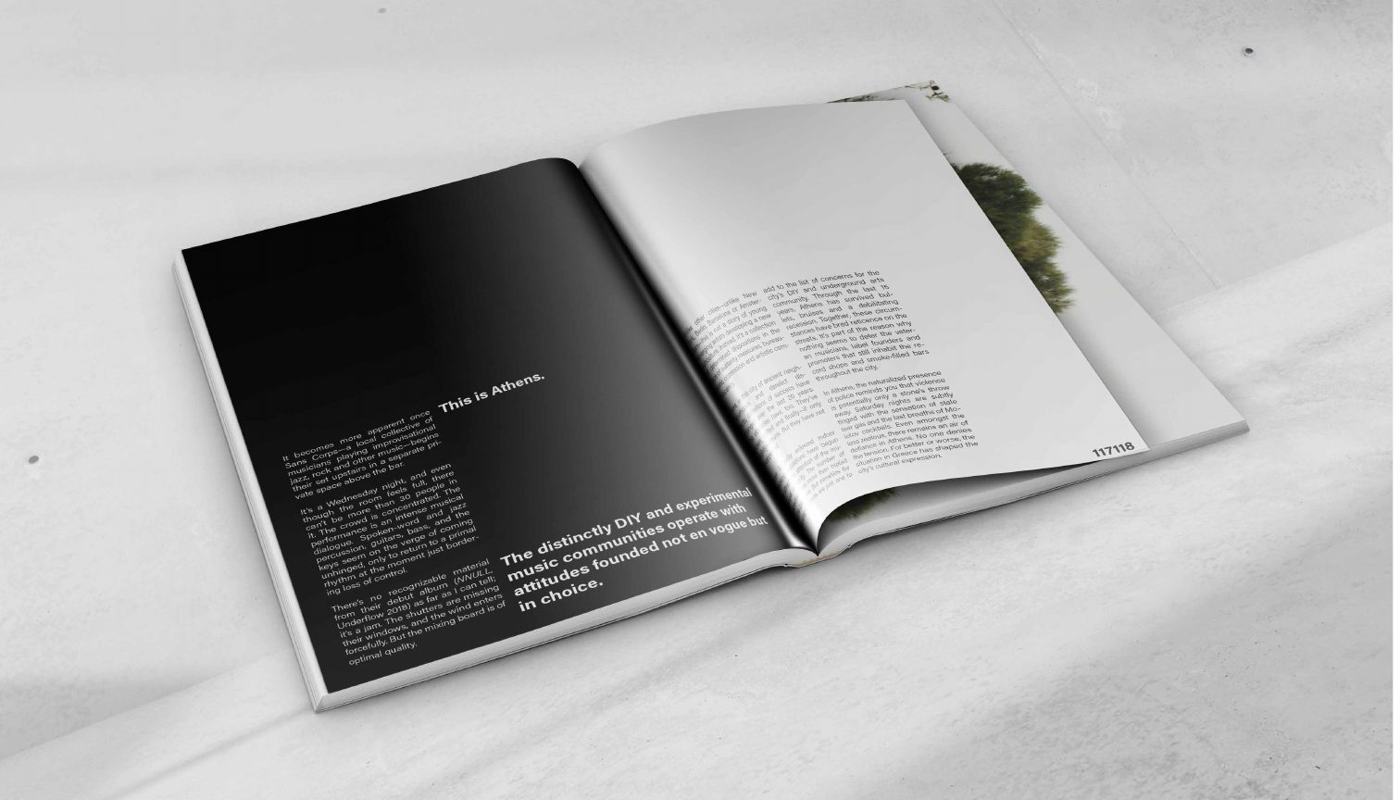
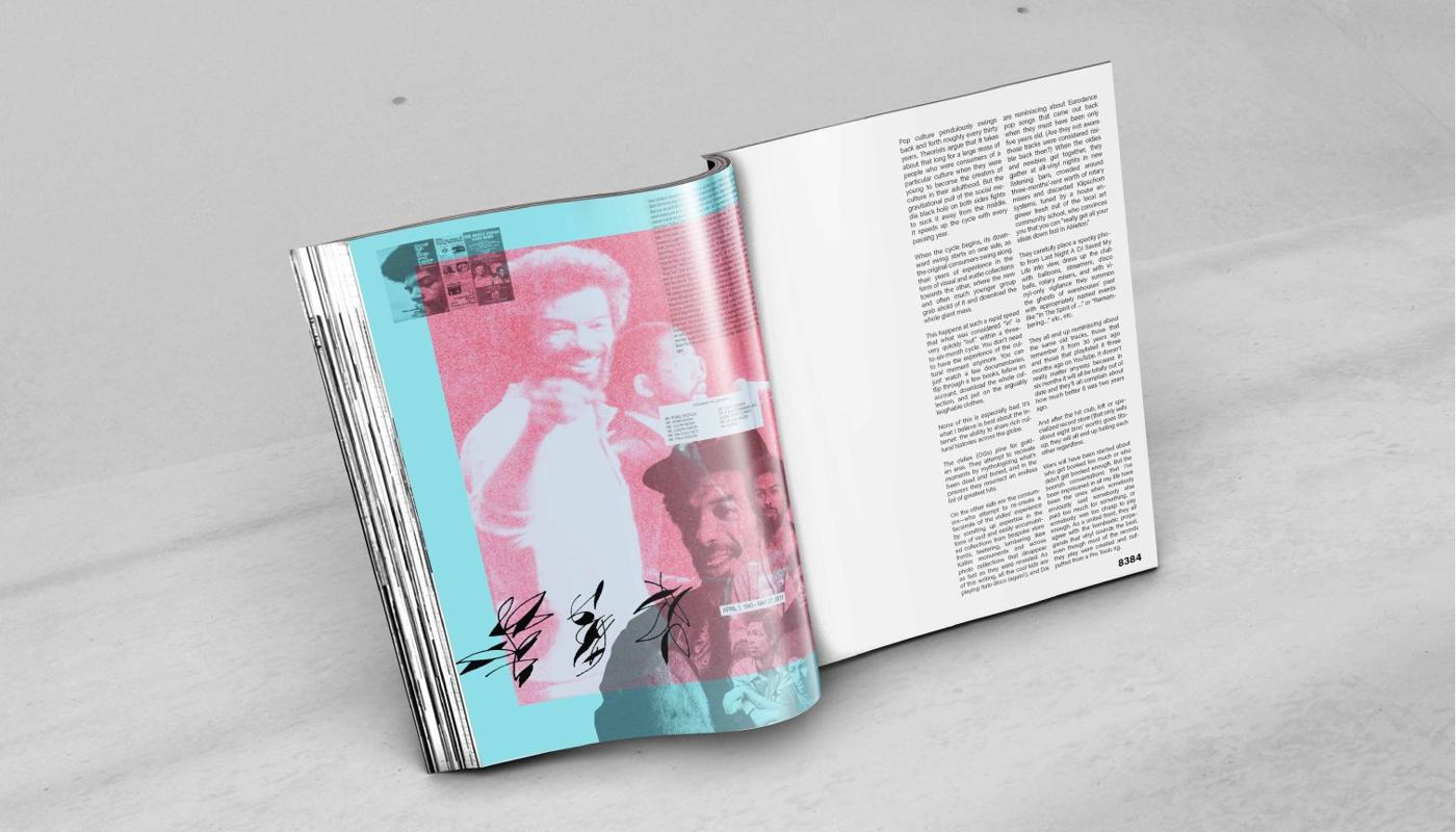
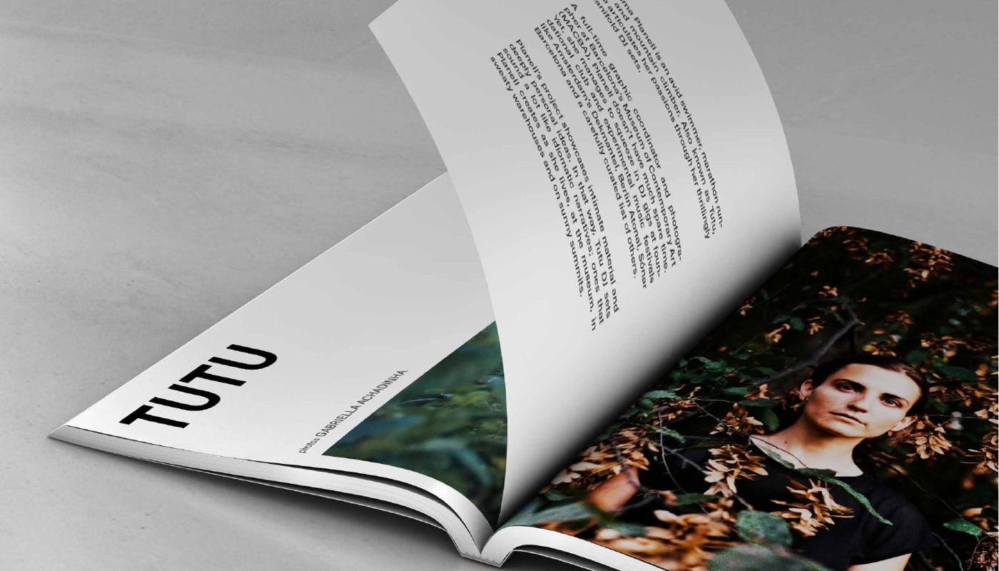
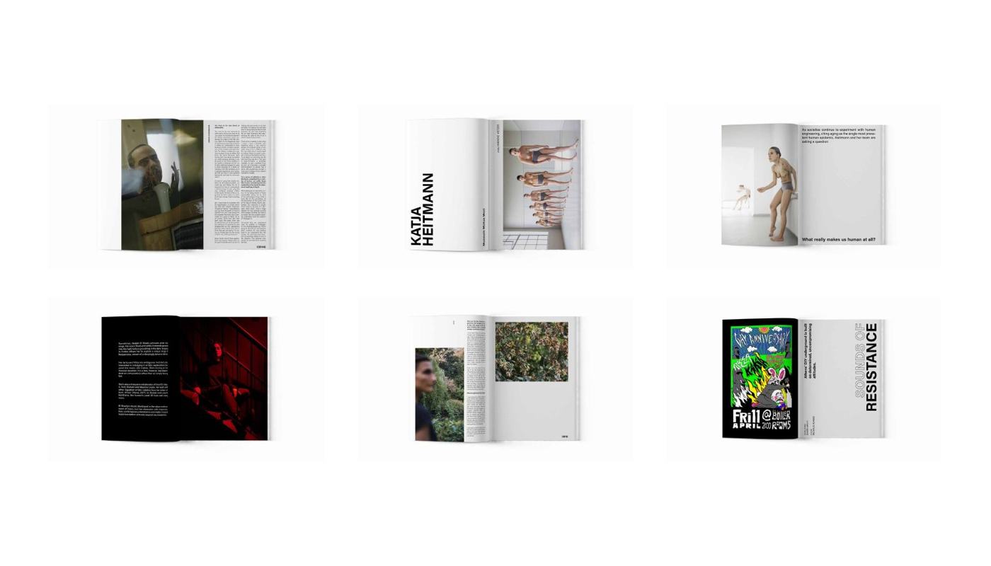
Berlin, 2019. A friend and I wanted a magazine about experimental music and art, so we made one. Eight issues later it was sitting in thirty-odd independent shops across Europe and North America. I ran the art direction. Heavy display type against a lot of white, black spreads where an essay needed to change gear, and a grid loose enough that a photographer could take a page.
- Year
- 2019 – 2025
- Scope
- Identity, art direction, layout, print production
- Extent
- Eight issues, 160 pages each
- Status
- Published, stocked in 30+ shops across the EU and North America
Aesus
Brand system / Art director, brand designer
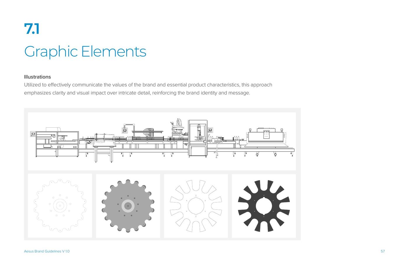
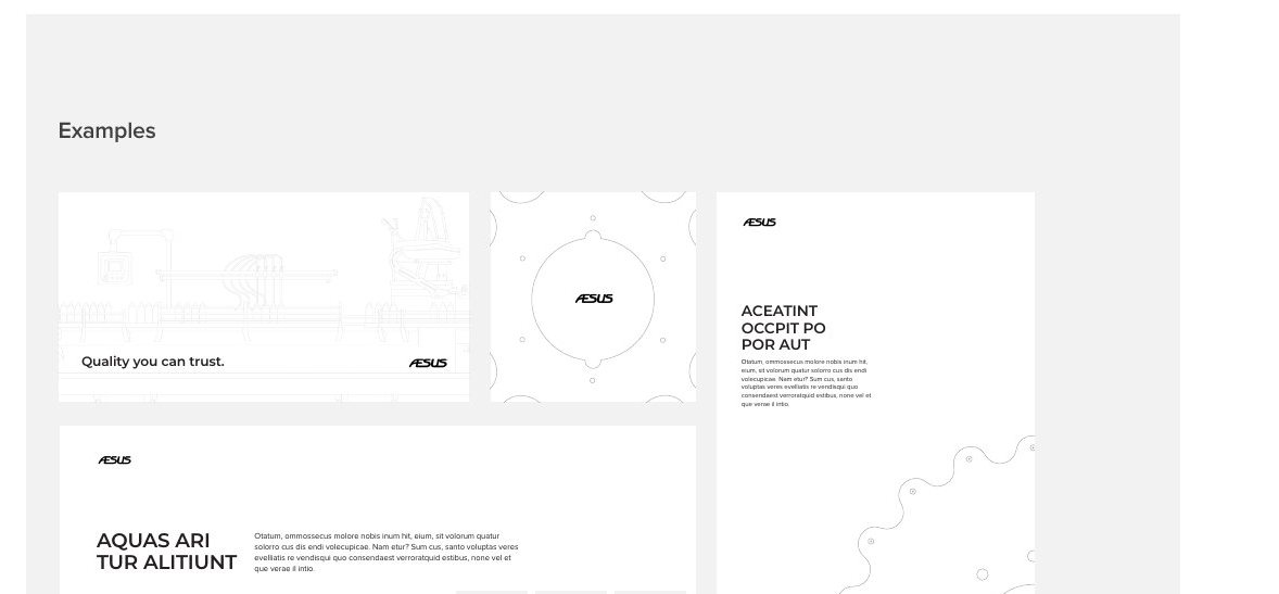
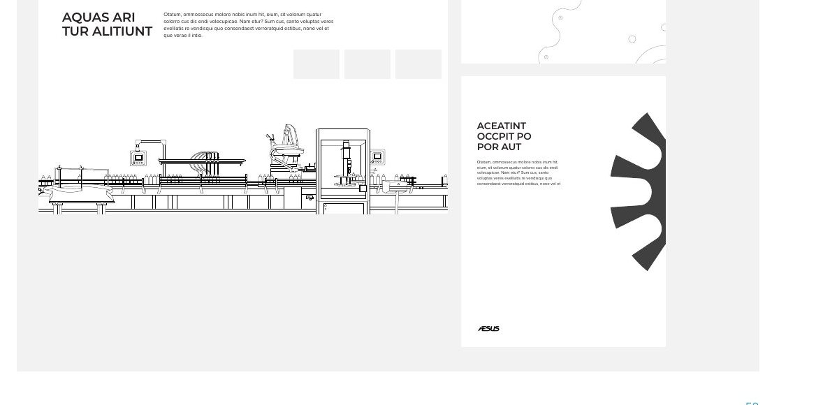
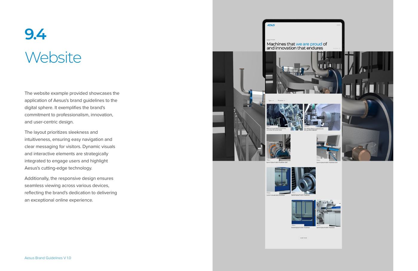
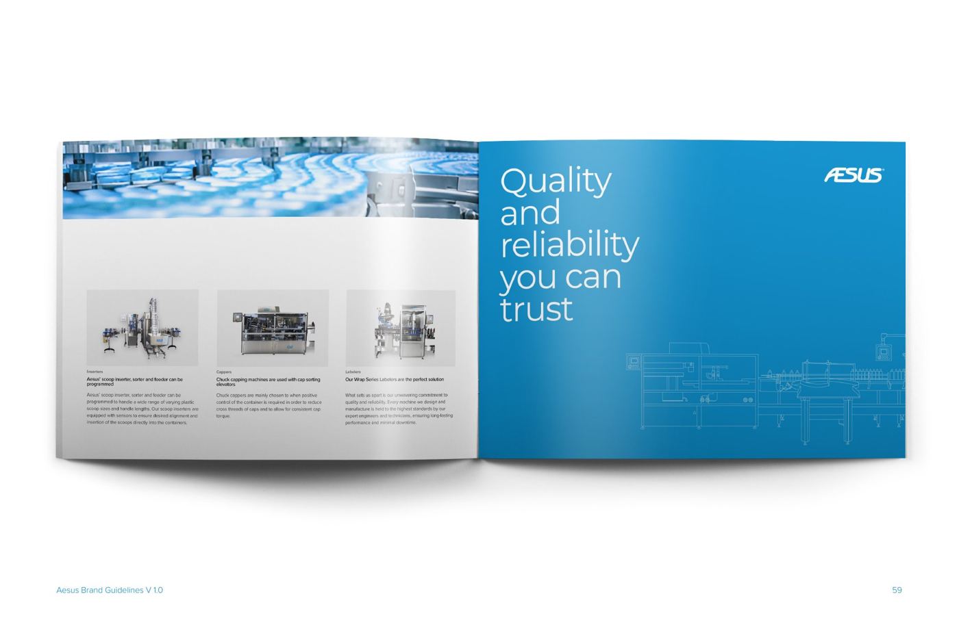
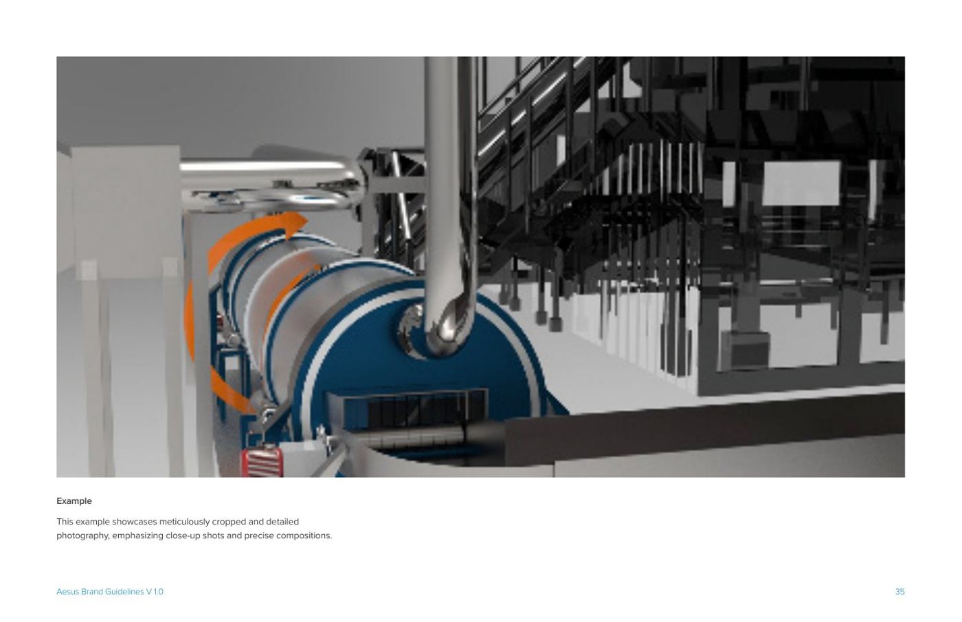
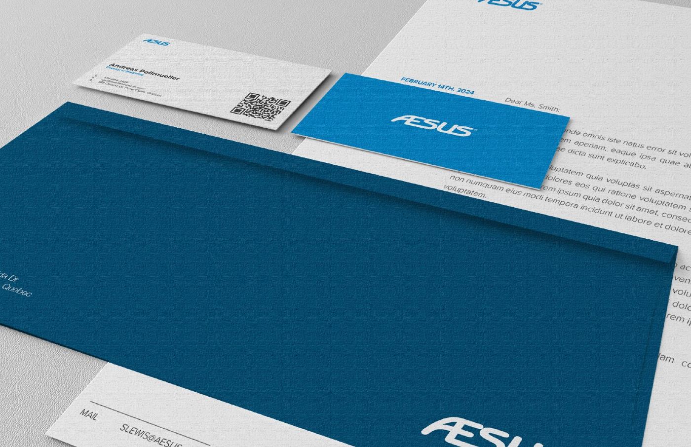
Nobody had written down how this brand should behave, so every brochure and trade show panel got invented from scratch by whoever was making it. The guide runs 72 pages and covers the usual ground. The part worth showing is the drawing. I had their production lines redrawn as line art, then cropped in hard, a gear tooth or a length of conveyor blown up until it works as texture behind a headline or a frame around a photograph. The same crop logic runs the product grid on their site. Their marketing team has no designer on staff and can still produce from it.
- Year
- 2024
- Scope
- Standards guide, illustration set, graphic usage rules, photo direction
- Extent
- Nine sections, story through application
- Status
- Client work, in use across print, web and trade shows
Voxel
Enterprise software · System / Design and art direction, through King Street Media

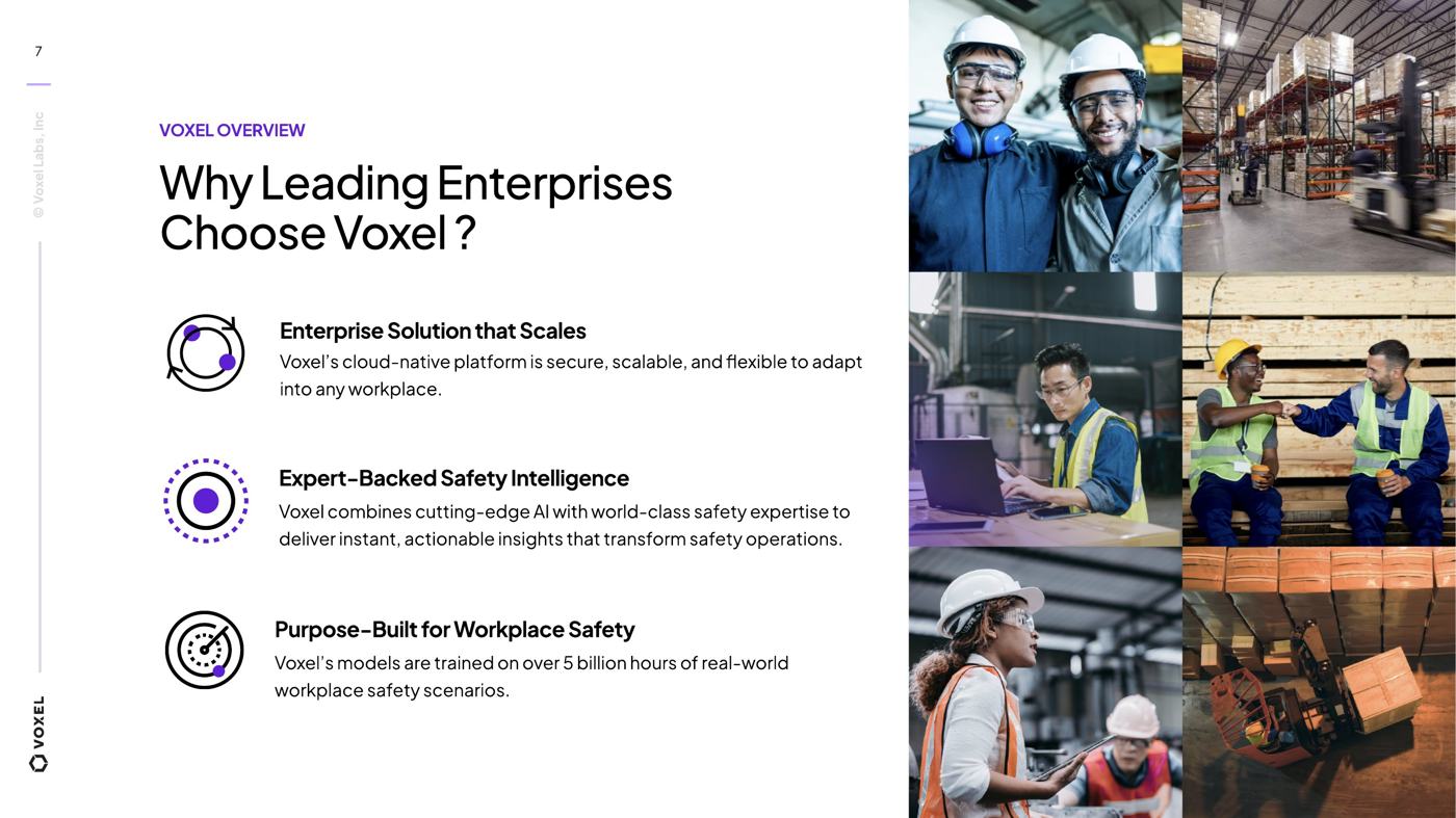
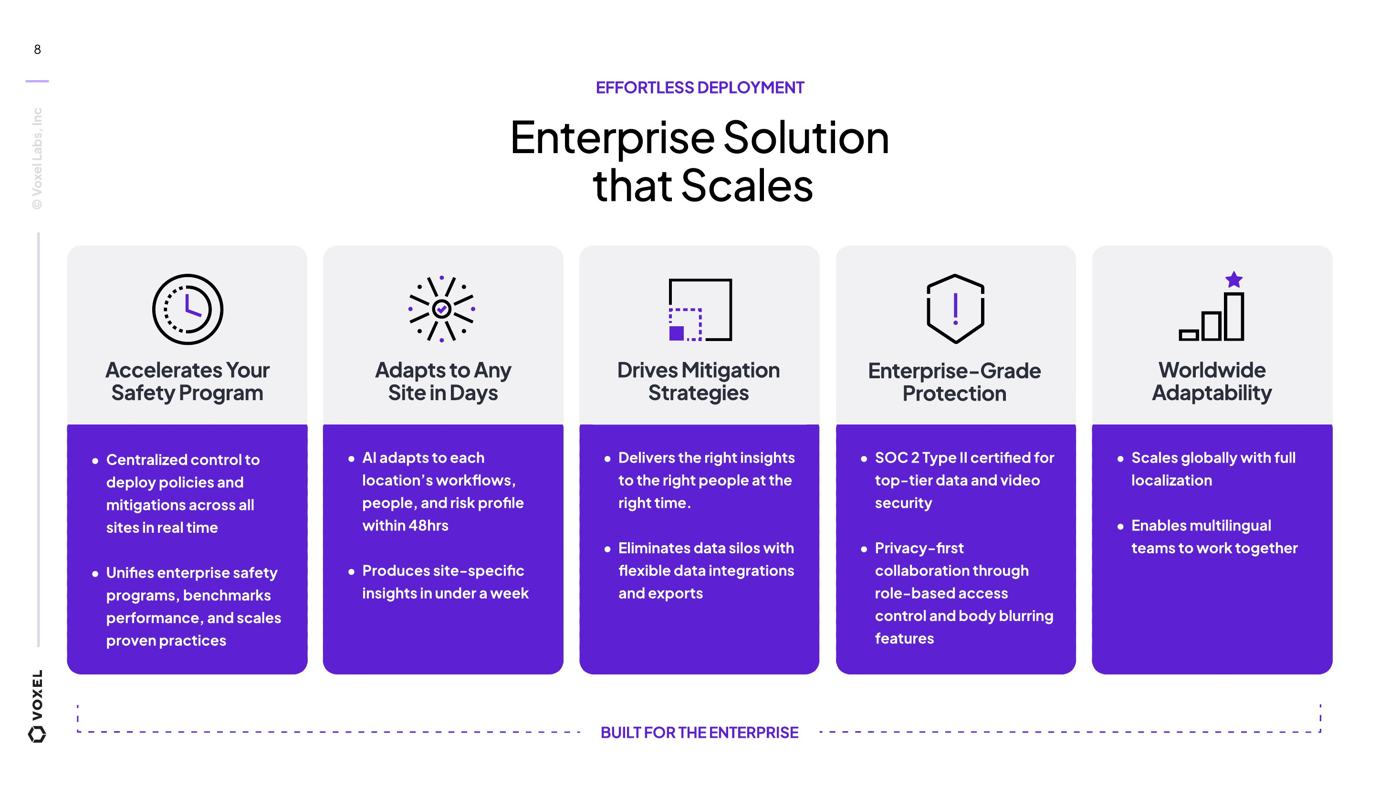
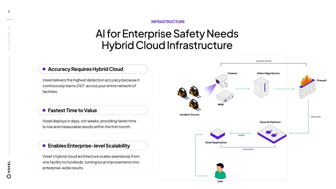
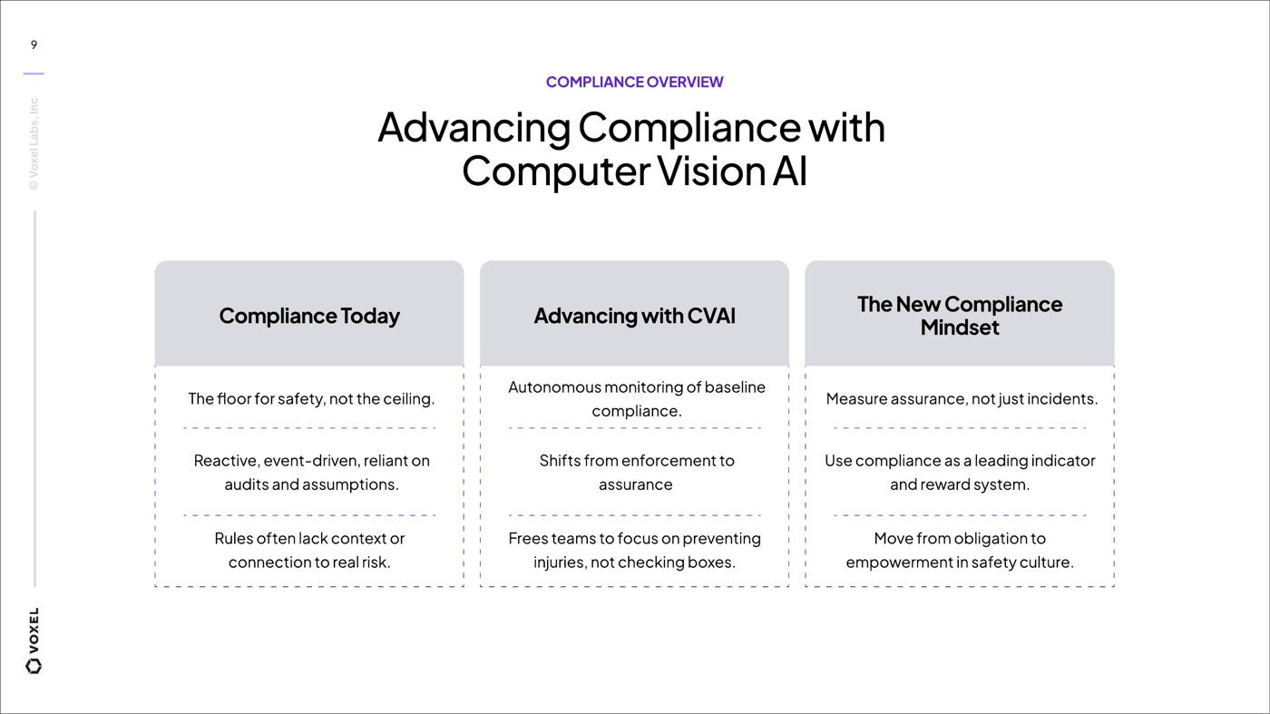
Voxel sells AI safety software into industrial sites, 250 or so at last count. The product is genuinely deep and the sales deck buried it in text. I audited the material and rebuilt it as a system, one type scale, cards for the comparisons, arguments staged across slides instead of stacked into bullets. Months later their own team extended it into a webinar programme I had nothing to do with. That is the part I am proud of. The hybrid cloud architecture went to an illustrator, and I pushed the isometric through revisions until you could follow it without reading the caption.
- Year
- 2025
- Scope
- Audit, slide system, information design, illustration direction
- Applied
- Enterprise sales deck, webinar programme
- Status
- Client work, in use and extended internally

FOUNDATION
Editorial · Annual publication / Design and art direction

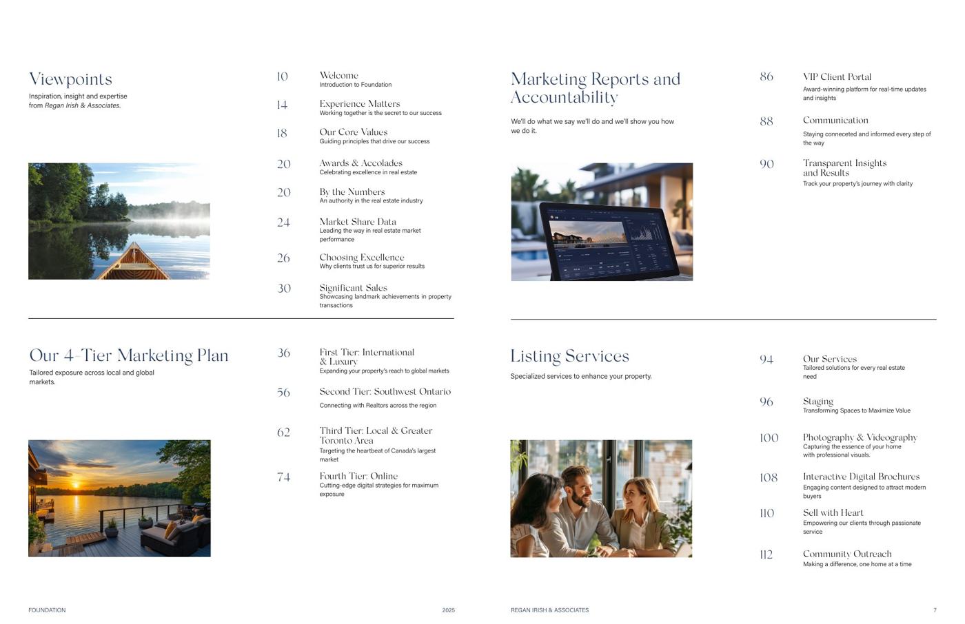
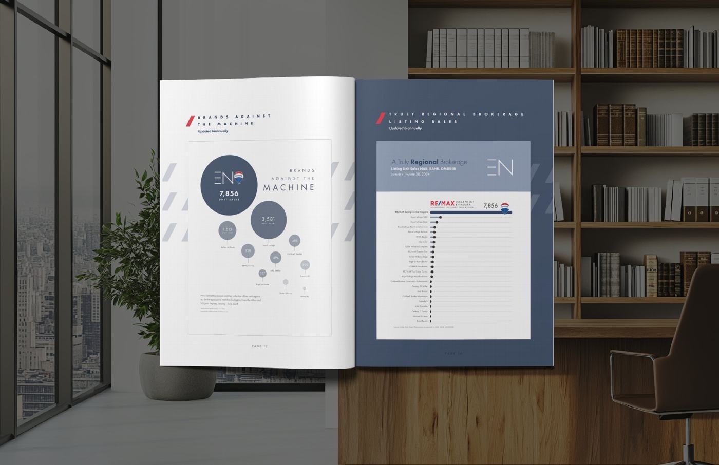
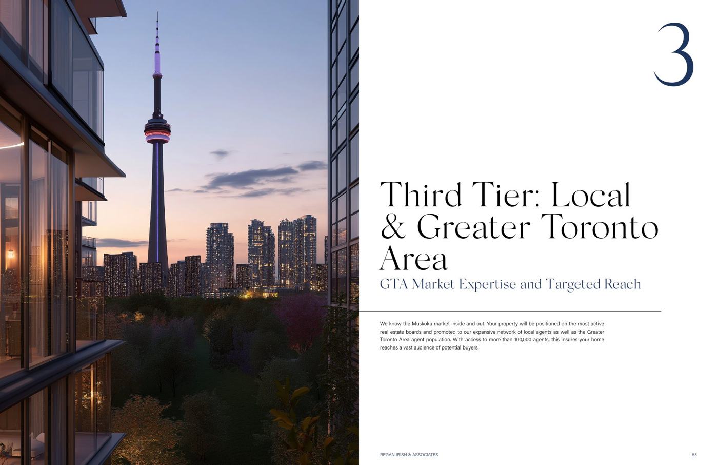
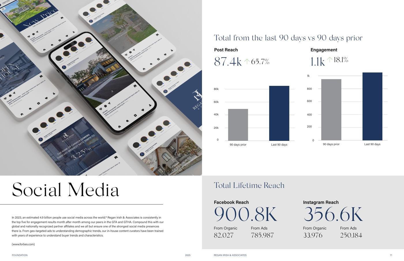
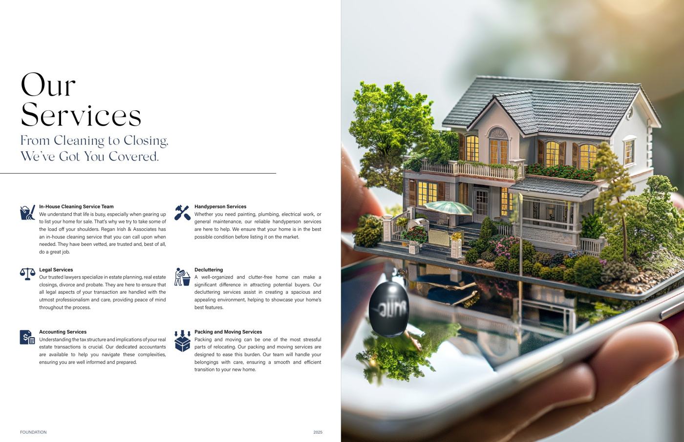
An annual guide for people selling their homes, produced in house for a 25 agent brokerage and printed to a publisher's schedule. Four kinds of content share one grid and one type scale, from section openers to long form writing to performance reporting. Service pages were the hard part. Information like that usually ends up looking like a brochure somebody dropped inside the book, and here it had to read as part of it.
- Year
- 2019 – 2025
- Scope
- Grid, type system, layout, photo direction, print production
- Extent
- 108 pages, earlier editions to 200
- Status
- Published annually, print and digital
SOMA
Wellness · Packaging / Creative director, brand designer, packaging designer
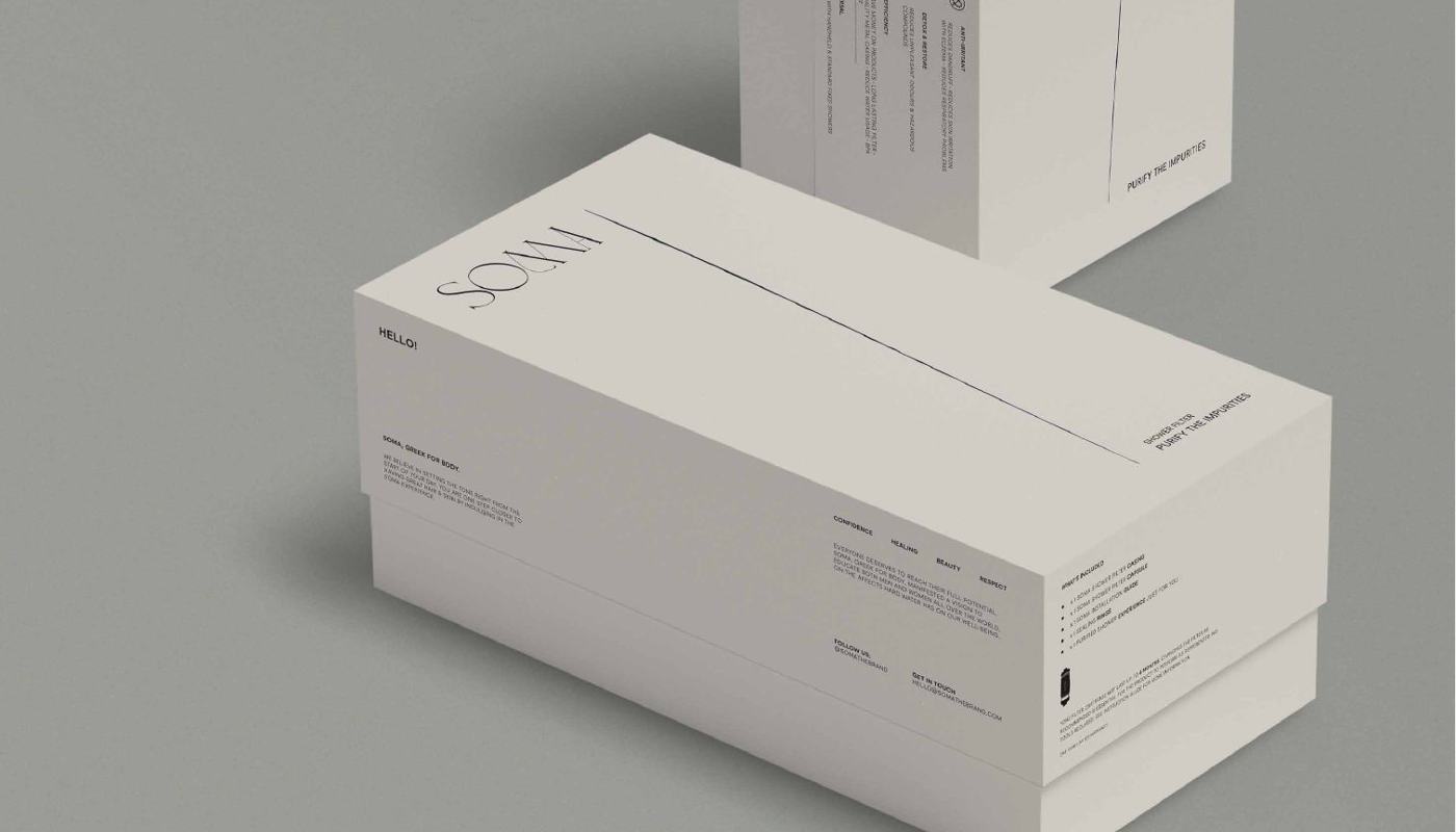
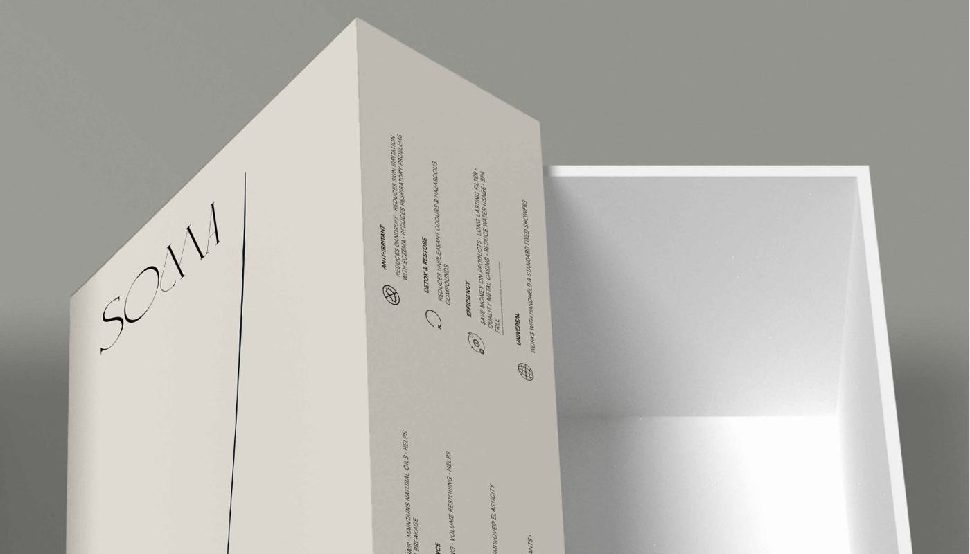
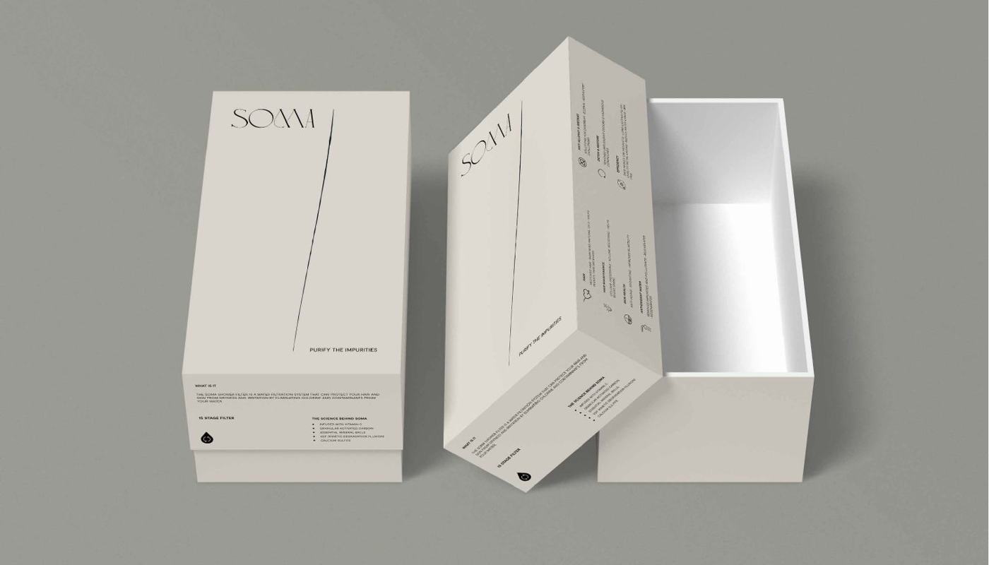
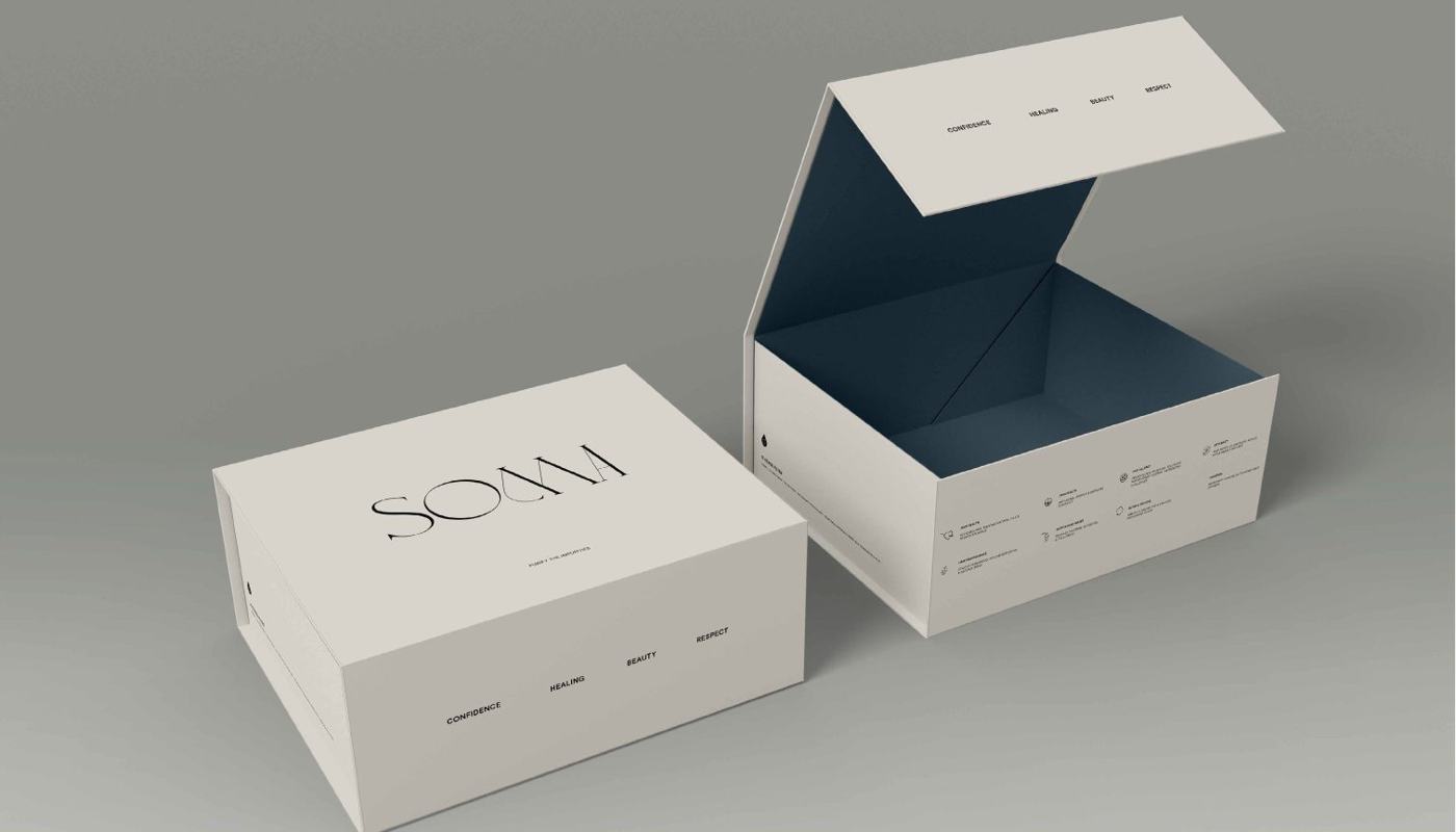
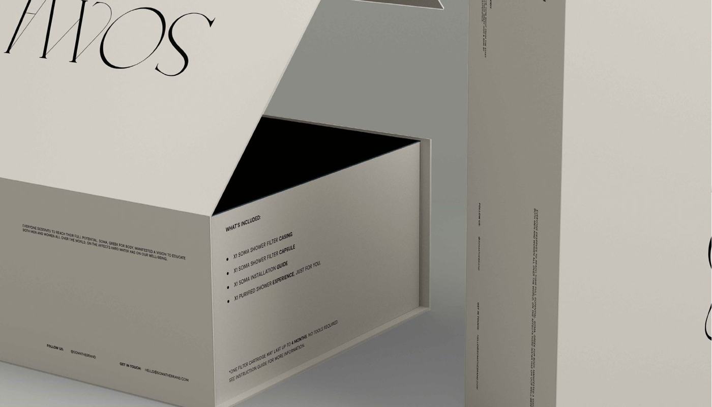
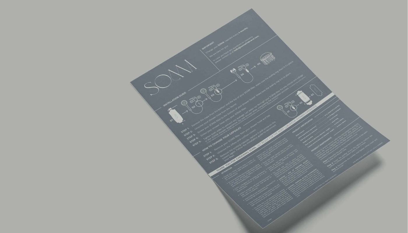
A showerhead filter competing in a category that looks like plumbing supply. The client asked for minimal, so the work went into structure and sequence instead. The box opens the way a beauty product opens. The wordmark appears rarely. Instructions are printed into the package rather than onto the insert everyone throws away.
- Scope
- Positioning, identity, packaging, brand guide
- Surfaces
- Carton, sleeve, rigid box, insert card
- Status
- Client work, in production
437 Swimwear
Apparel · Direct to consumer / Art director, graphic designer
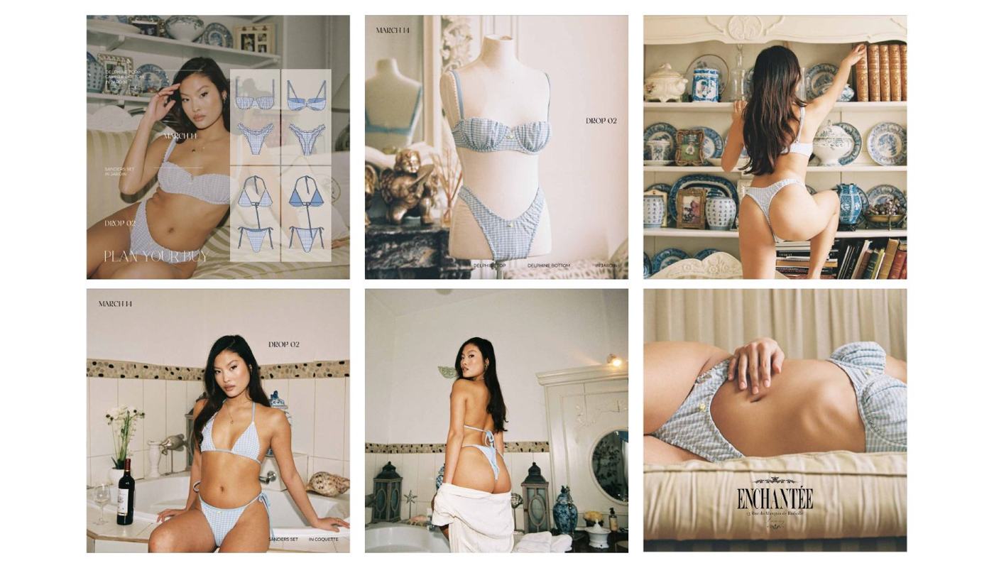
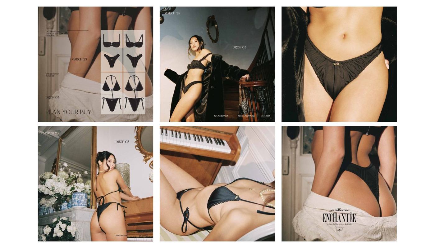
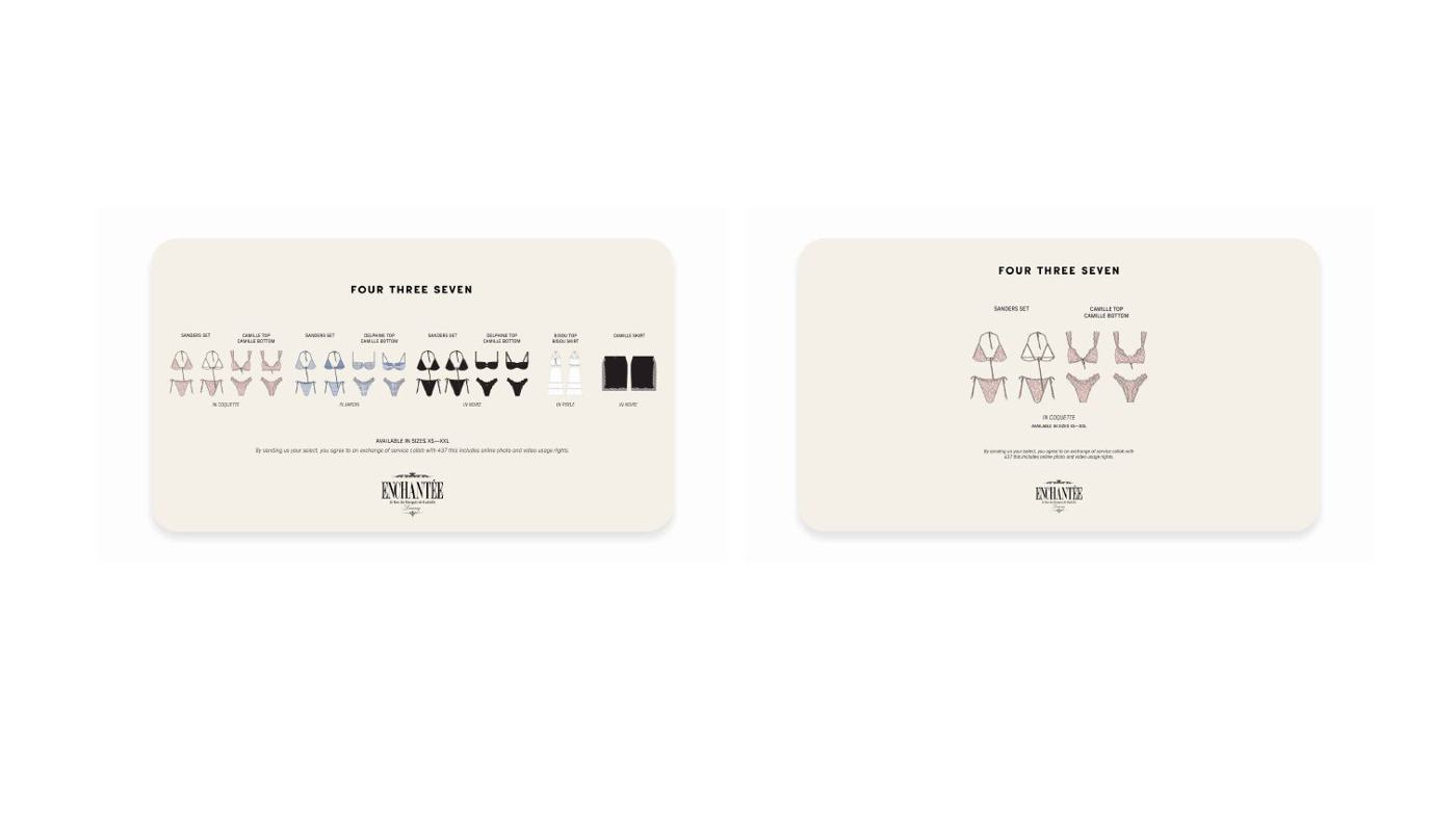
Campaign and social for a swim and intimates label that sells in drops. Layouts pair the campaign shot with the range, so you can see what is actually for sale. Type stays quiet. The photography is the brand.
- Scope
- Social content, campaign layouts, marketing collateral
- Status
- Client work, published
Get Ducked
Consumer product / Creative director, brand designer
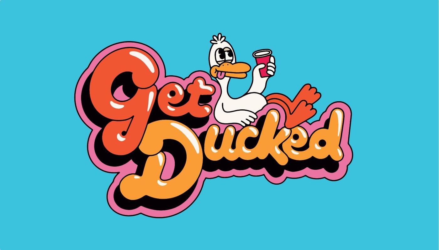
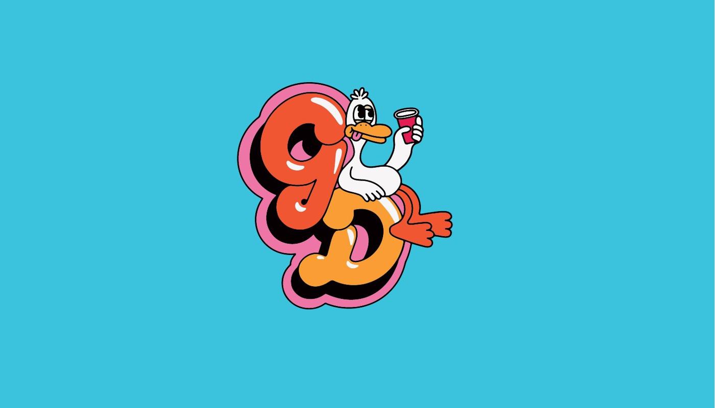
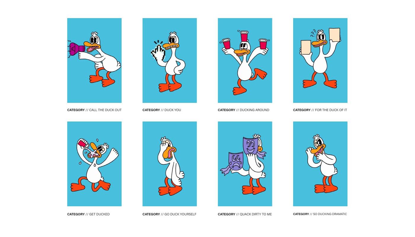
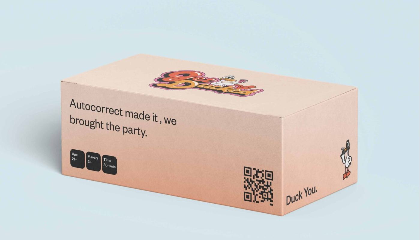
A party card game that runs on nerve. Chrome edged script for the wordmark and a duck with bad manners, drawn by an illustrator I briefed through the full set of poses, one for each card category. The writing and the drawing had to land at the same time.
- Scope
- Identity, illustration direction, packaging, card system
- Set
- Eight character poses, eight card categories
- Status
- Designed for launch, not yet released

City Shred
Digital · Events / Art director, UI designer
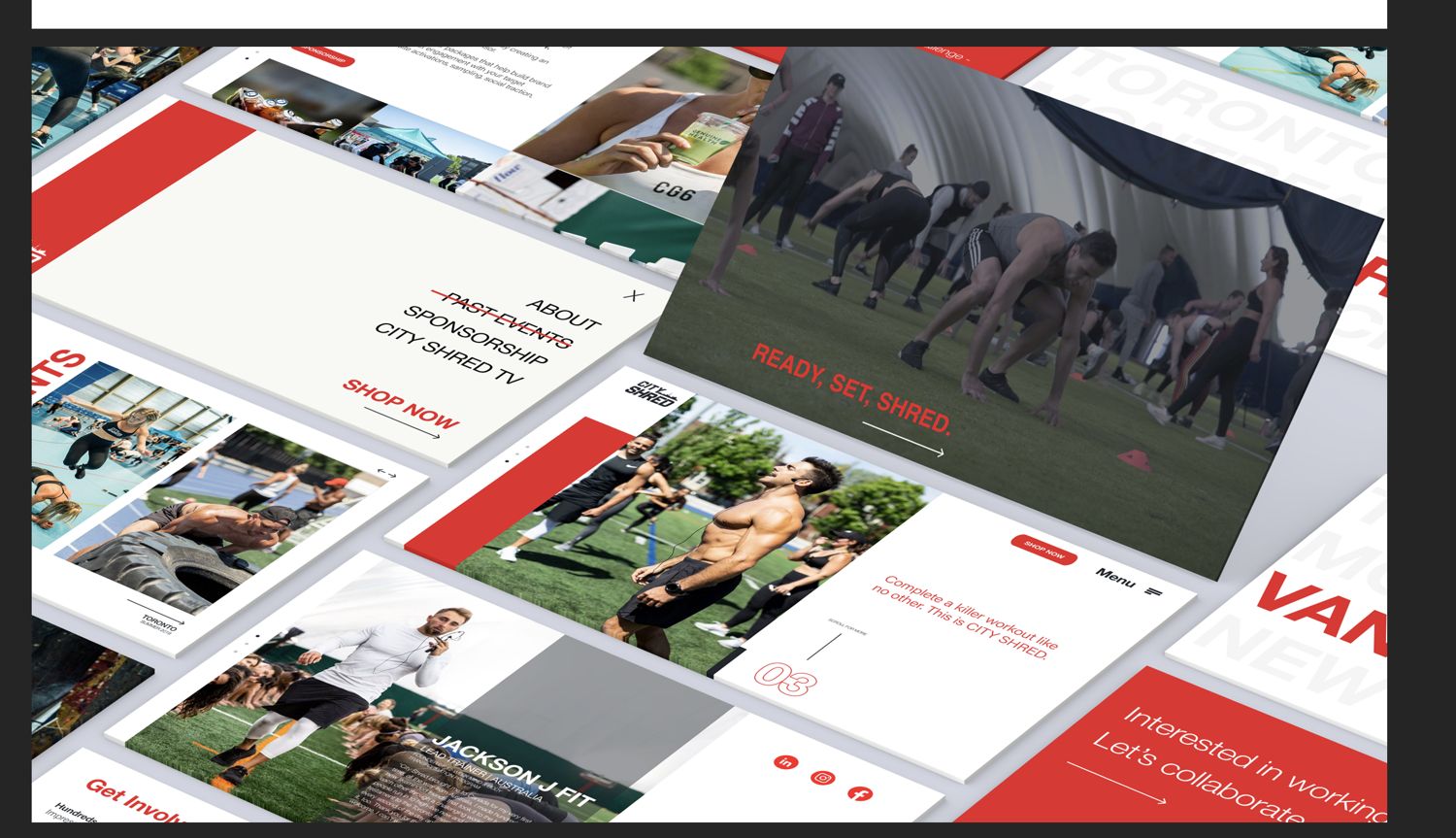
Large scale fitness events, and a site that had to feel the way the room sounds. Red on white, condensed caps set on the diagonal, photography of people mid-effort rather than posed. I designed the interface and built the photo treatment the brand ran on, long exposure trails pulled out of the event photography, then directed the development team through the build.
- Year
- 2020
- Scope
- UI design, photo treatment, build direction
- Status
- Launched 2020, site still running

Direction
- Art direction
- Brand strategy and positioning
- Creative direction for campaigns
- Illustration commissioning
- Photography and image direction
- Direction systems for generative work
Design
- Brand identity and marks
- Guidelines and brand systems
- Packaging
- Editorial and publication design
- Presentation and pitch design
- Information and data design
- Campaign, social and digital
- Web and interface design
Production
- Template and asset systems
- Print production and prepress
- Motion and video editing
- Creative intake and workflow
- Briefing and reviewing other designers
Tools Adobe InDesign, Illustrator, Photoshop · Figma · DaVinci Resolve · Keynote, PowerPoint · Monday.com, Notion · Claude, Krea, Higgsfield